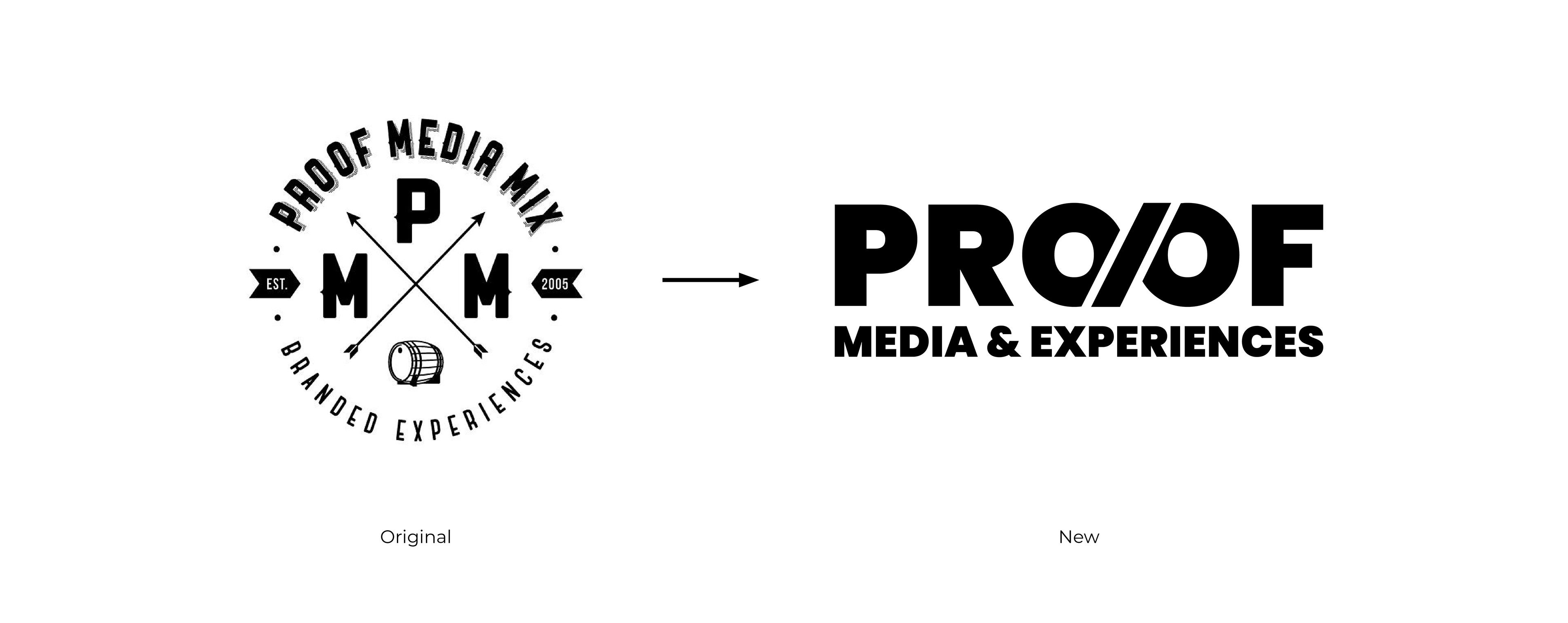
Proof Media Mix had built its reputation on bold, immersive branded experiences since 2005, but its visual identity hadn't kept pace. The goal was to evolve the brand into something cleaner, more modern, and built to perform across websites, pitch decks, merchandise, and everything in between.
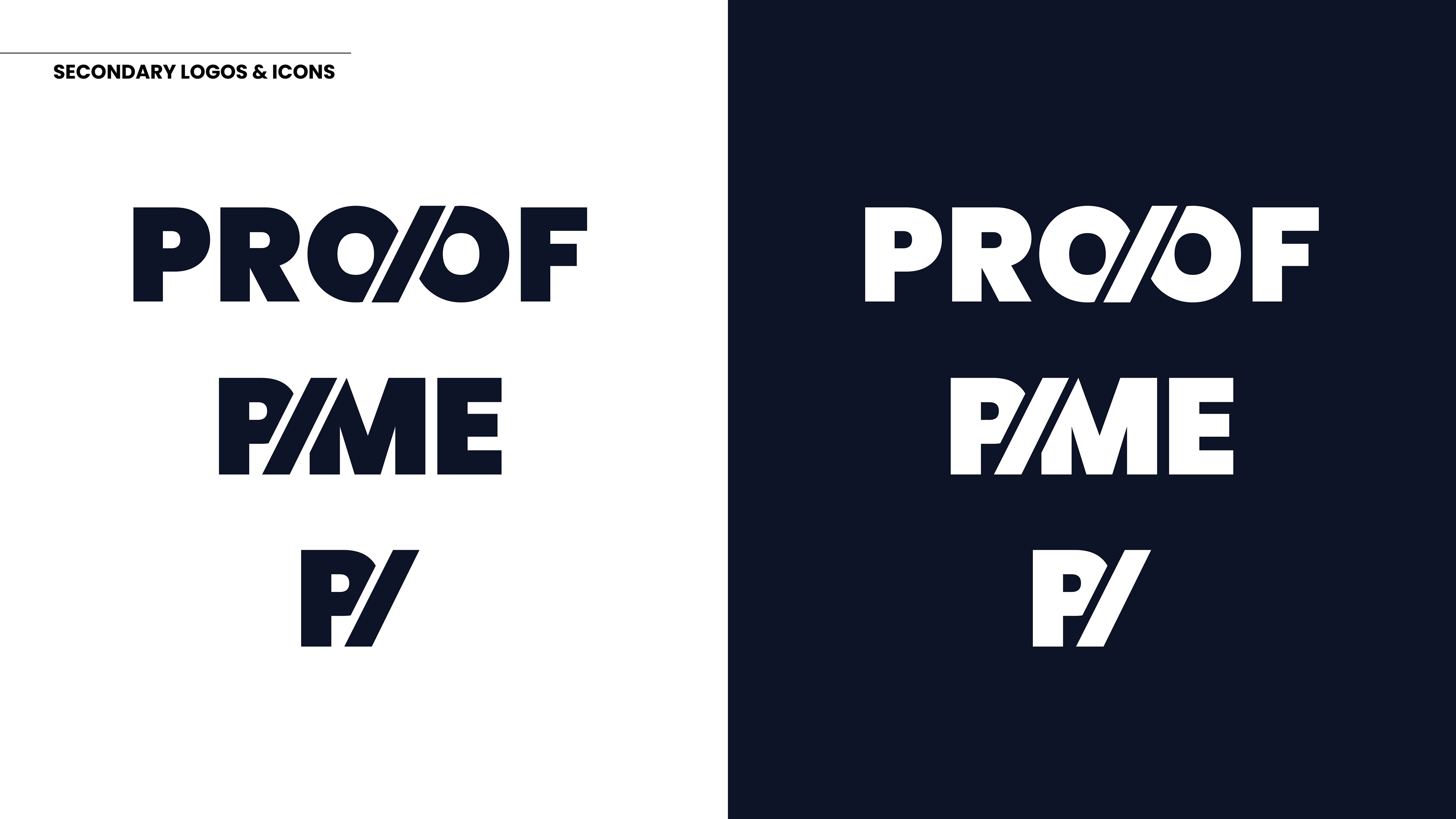
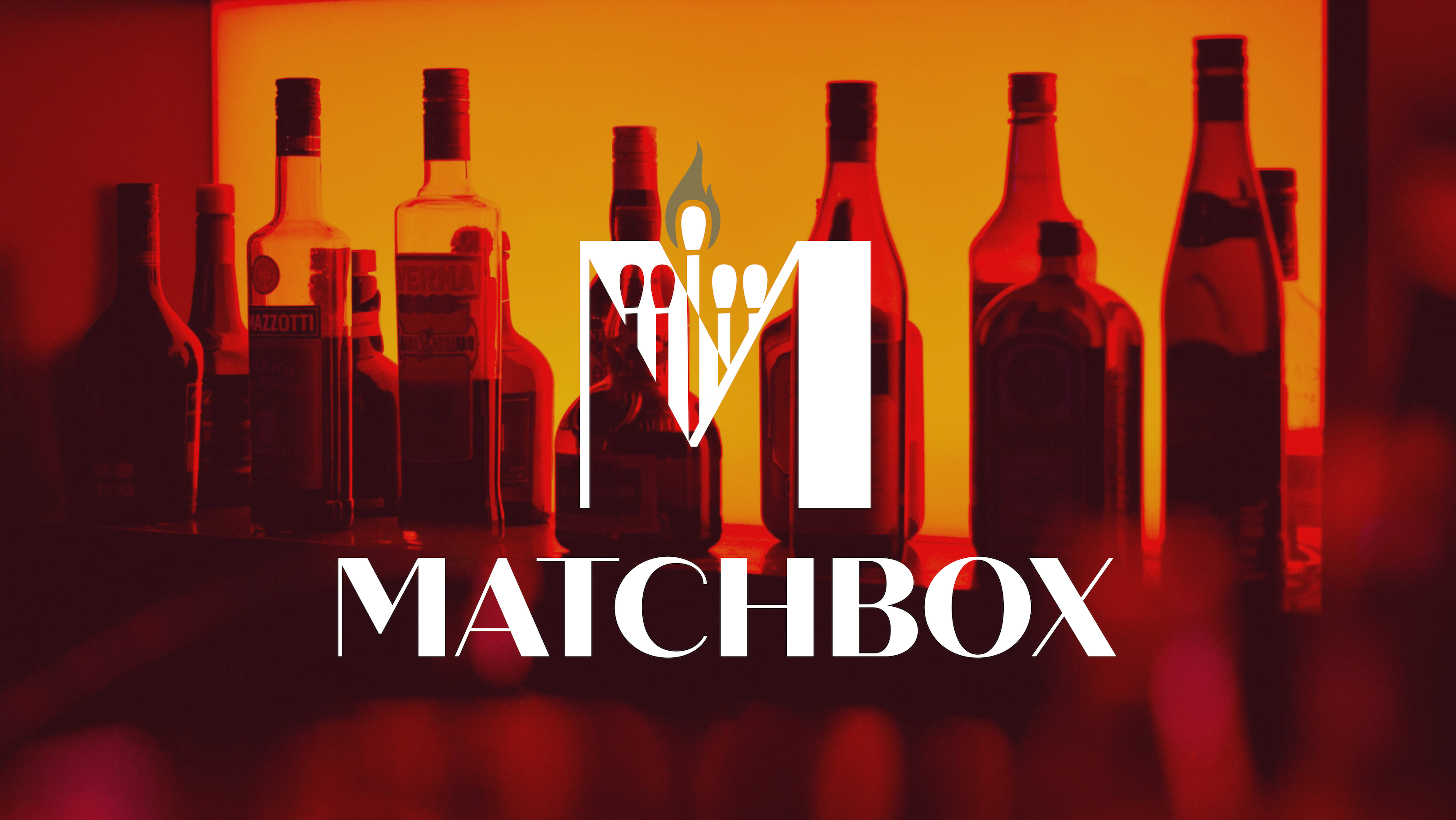
The rebrand centers on a reimagined wordmark that weaves a % symbol into the "PROOF" lettering, a nod to the spirits industry where "proof" not only signals alcohol content, but also signals the precision and intentionality that the agency brings to every activation. Bold, stark, and immediately recognizable, the mark strikes a balance between heritage and a contemporary edge.
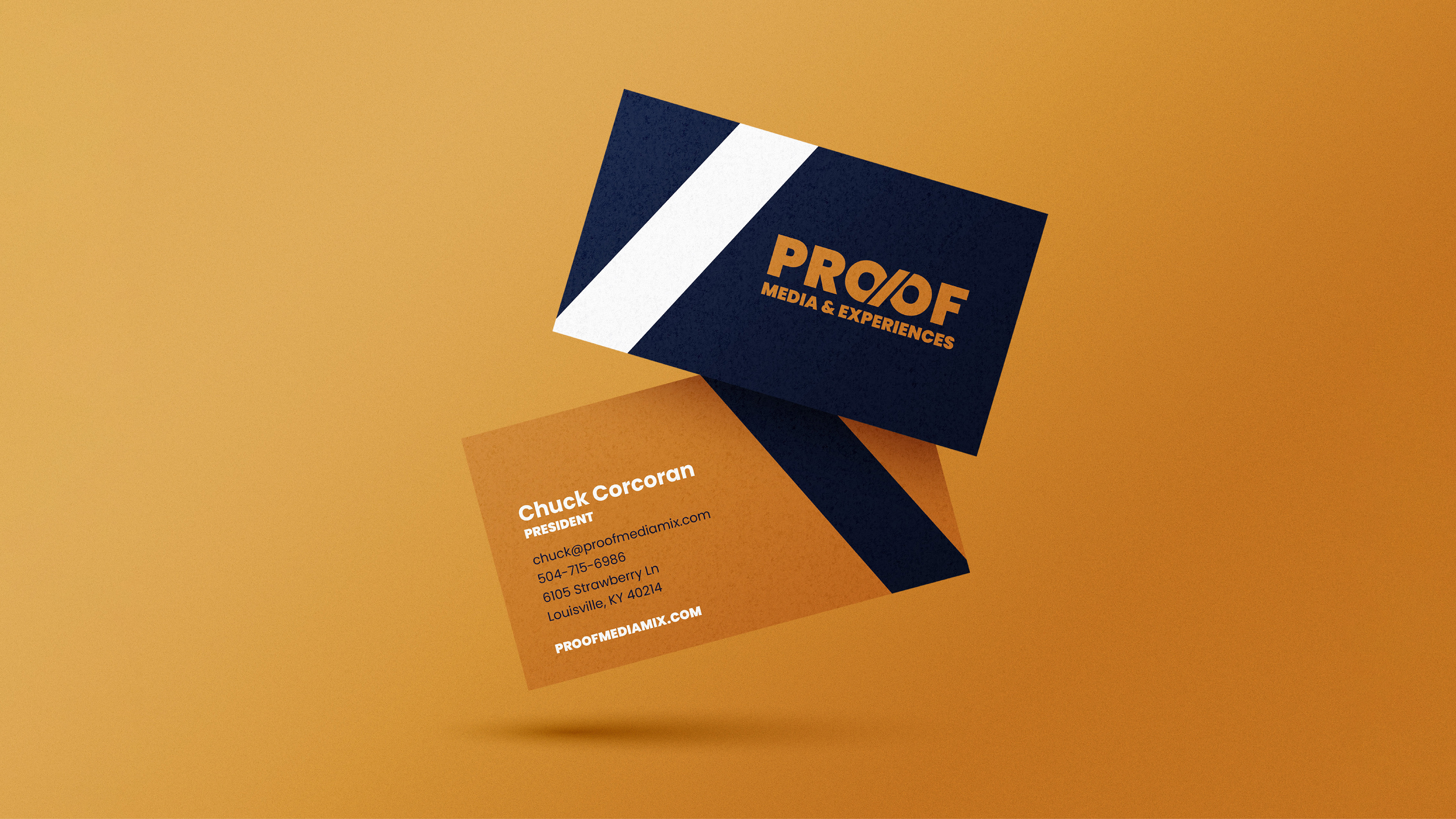
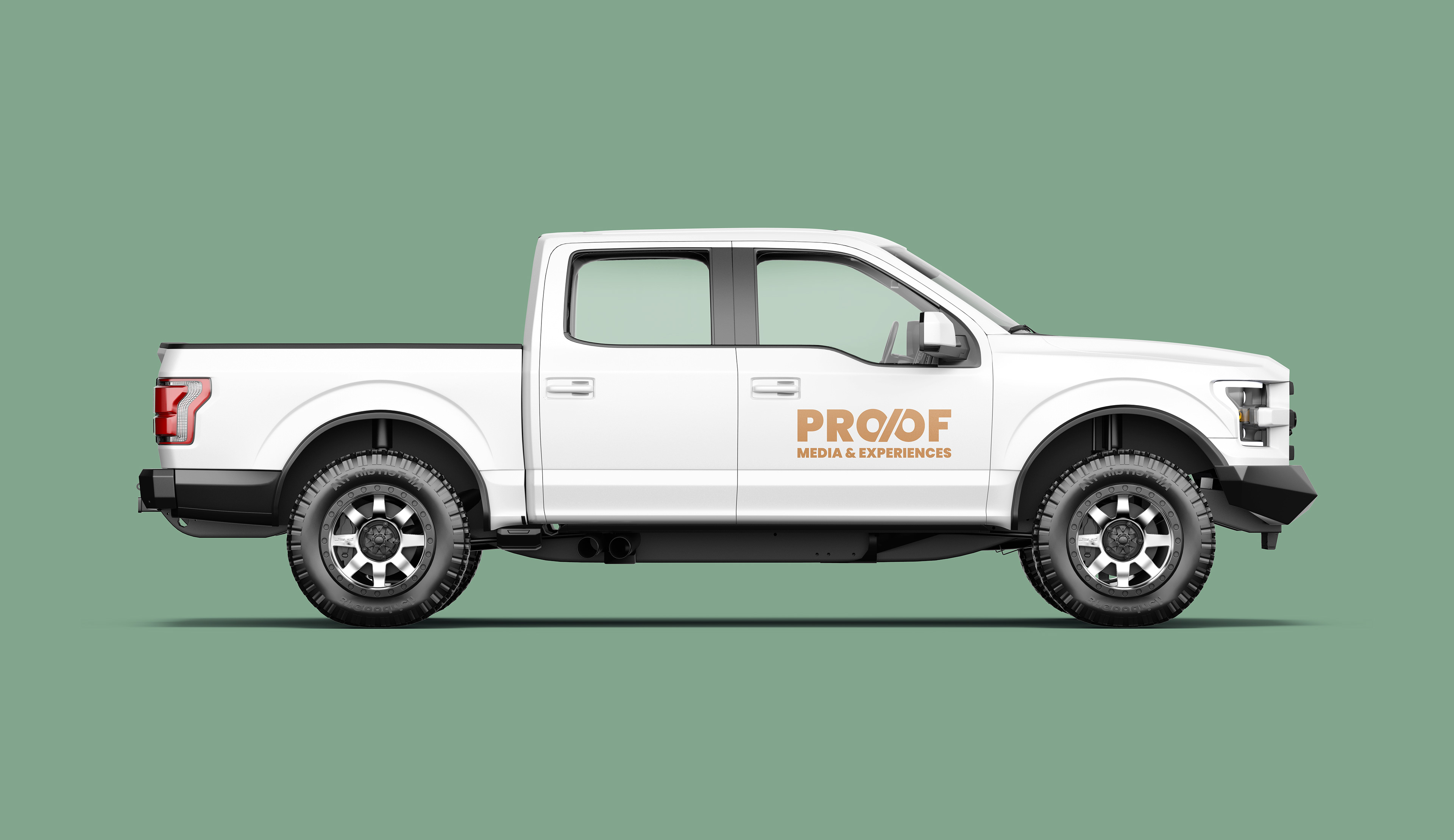
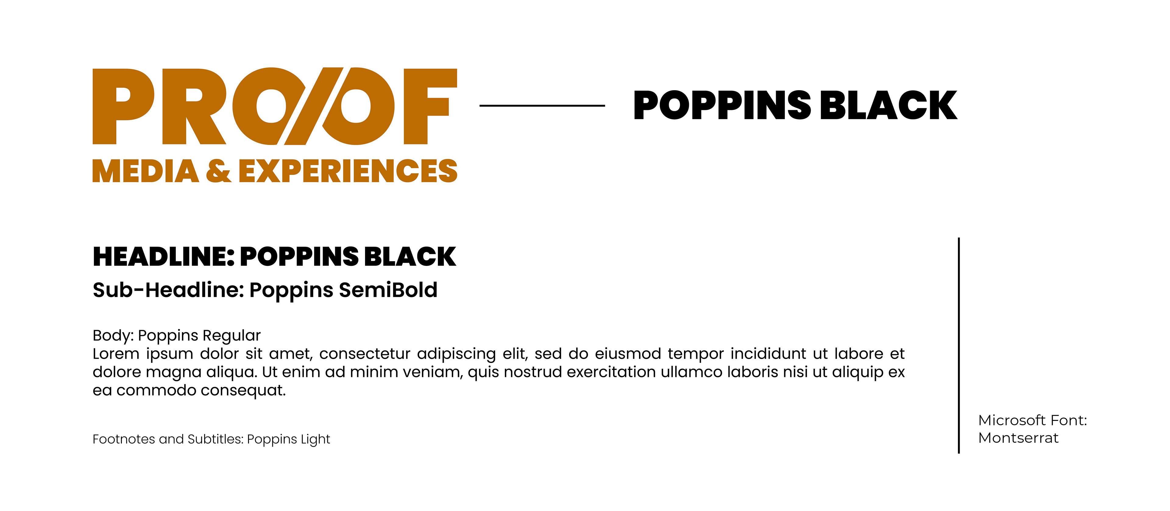
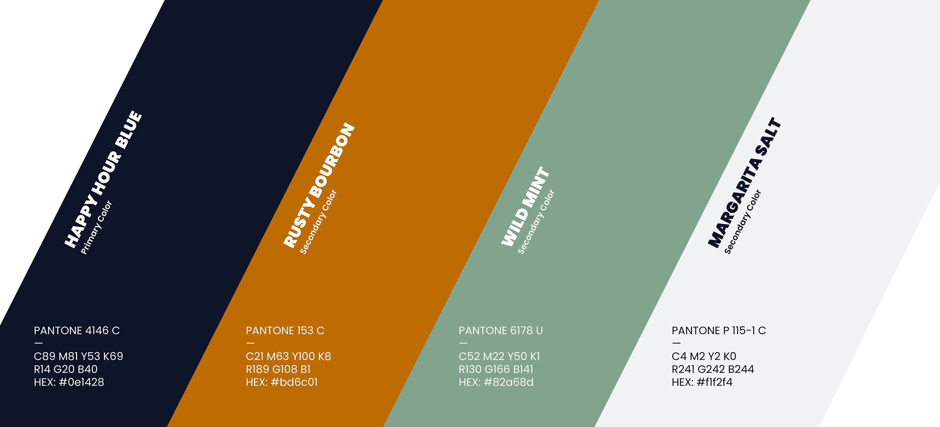
The full brand system includes the company's updated name "Proof Media and Experiences," a rich color palette anchored by deep navy and warm bourbon tones, a Poppins-based typography suite, and business card designs that bring the new identity to life across print touchpoints.
*Created with the Highball Agency, Louisville, KY